If you think improving customer experience using embedded help is limited to tooltips, think again. Here we show you 5 embedded help examples that you may not have considered.
Mailchimp is a brand that is famous for thinking outside the box. We found 5 great examples of embedded content in this web-based email marketing software. At least one of the examples goes beyond just providing help, which goes to show that not all contextual content is explicitly User Help.
Any of these 5 embedded help examples could be used in your software and even added as contextual help, appearing only when appropriate.
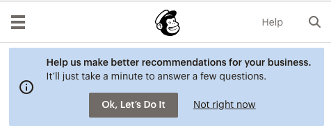
1. Solicit customer feedback
And here we have the first example of non-help. Rather than offering user help, Mailchimp is soliciting customer feedback to improve the embedded help in its software. This message inside Mailchimp is contextual in that it only appears based on some user parameter and doesn’t reappear once the user responds.
2. Help your customers succeed
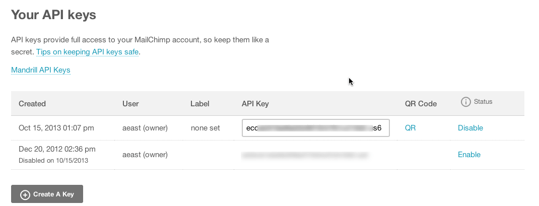
Mailchimp uses tips in a smart way. The Tip messages (also contextual based on user parameters) are more about helping customers reach overall business goals, not just software success. Mailchimp understands that when users are successful, they’ll become loyal customers.

In Mailchimp, you can manage API keys for integrating the service with other services you use, such as email signup forms on your website. In the API keys part of the UI, Mailchimp offers a link to an article about keeping API keys safe. It’s a creative use of embedded content that aims to help customers succeed.
3. Onboard with a gif
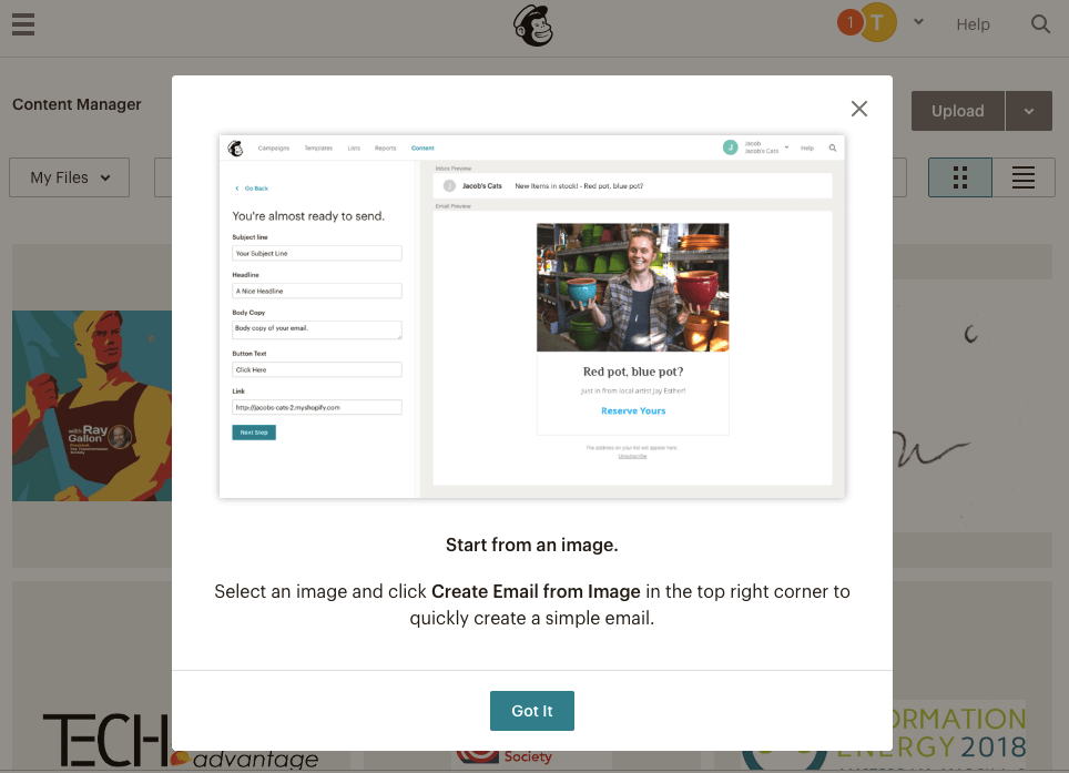
Embedded help is not only text-based. Images, video and gifs can be added to an embedded help popup. For new users, the help can be contextual in that it only appears on first login or after some other user parameter is met.
In this onboarding example, Mailchimp uses a gif within a popup that suggests the user create an email from an image. Interestingly, the text in the embedded help doesn’t say you can also create an email from a gif, but the gif in the popup makes it obvious.
Short gifs are also a good way to show a quick feature in software. An embedded video could do the same.
4. Promote new features
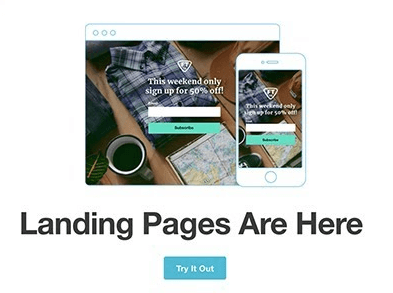
Why limit new software features to release notes? Make it obvious to users that your software has new features by embedding it right into the software. When Mailchimp launched landing pages as a new feature, users got a popup showing the feature and including a link to try it out.
5. Link to next steps
Using embedded and contextual help, you can direct users to another part of the software when they need to complete another step.
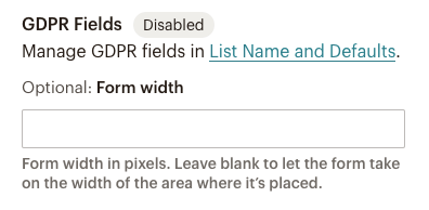
In this example, Mailchimp provides an option to embed GDPR fields (privacy options) into signup forms. In the screenshot below, the UI offers the option to add a custom width to the form. But in another part of the software UI, you decide what fields to include. The embedded help provides the link to manage GDPR fields.
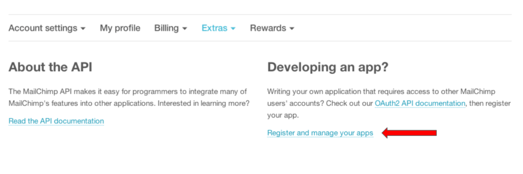
Mailchimp uses the same concept in directing developers to register and manage apps they may be creating for integrating Mailchimp with other services. Next to the API setting, developers get a link to an online article.
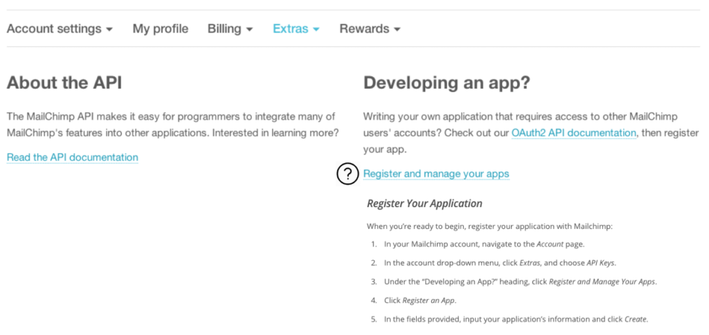
With edc, we suggest embedding the steps in the software. Why make users leave your software to get the information they need? Here’s our version of how Mailchimp could embed this user help.
What can you do with edc?
We can think of dozens of embedded help examples using edc. In fact, edc has its own embedded help so users can quickly surpass the not-so-steep learning curve. In edc, tasks, steps, tooltips and related articles that link to edc online help means you can quickly start to use edc andto add embedded & contextual help to your software.
Try the demo to see edc embedded help.
Click the HELP (?) icon anywhere in the software to learn more.


